Creating a bathroom that’s safe and easy to use is a top priority, especially for older adults or anyone with vision or mobility challenges. One of the simplest and most effective ways to do this is using colour contrast. This approach involves selecting colours that stand out from each other to make key features more visible.
Using colour contrast thoughtfully can help people navigate the bathroom, avoid slips or falls, and maintain independence. In this guide, we’ll explore what colour contrast is, why it’s important, and how to use it in different areas of the bathroom.
What Is Colour Contrast, and Why Is It Important?
Colour contrast refers to the difference in brightness and colour between two surfaces or objects. When there’s a high contrast, it’s easier to tell the two apart. For example, think of a dark-coloured floor next to a light-coloured wall — they create a clear boundary that’s easy to see.
Colour contrast is especially important in disability-friendly bathrooms. Bathrooms can be tricky to navigate because they often have similar tones throughout. For example, a white toilet on white tiles can blend in, making it harder to spot.
Good colour contrast improves visibility and helps people feel more secure. It can also prevent accidents by making it easier to identify features like grab bars, sinks, or shower edges.
How to Use Colour Contrast in Different Parts of the Bathroom
Here’s a closer look at how to use colour contrast effectively in specific areas of the bathroom:
Floors and Walls
Floors and walls are the foundation of any bathroom design, and adding some contrast between them can make a big difference. When the floor and walls are clearly distinct, it’s easier to see where one ends and the other begins, which helps people stay oriented—especially older adults. Falls are a major concern and the most common cause of death from injury in people over 65.
To make things safer, pair light-coloured floors, like beige or white, with darker walls in shades like grey or navy. If you have a dark floor, lighter walls are a great option. And don’t forget about non-slip flooring. Materials like textured vinyl or tiles give better grip, even when wet, and can help prevent accidents.
Bathroom Fixtures
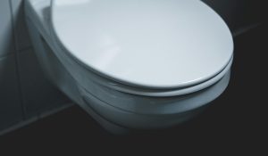
Bathroom fixtures like the toilet, sink, and bathtub can sometimes blend into the background if they’re too similar in colour. Adding contrast makes them stand out. For example, a white sink or toilet can be hard to see against white walls. To fix this, choose fixtures in colours that contrast with your walls and floors. If your walls are white, a grey or black toilet seat can make a big difference.
Grab bars are another area to highlight with contrast. Matte black, chrome or brushed nickel finishes look great against light walls, while white grab bars stand out better on dark tiles.
Shower Area
The shower area is one of the riskiest parts of the bathroom, so it’s important to make its edges clear and easy to see. A well-defined shower area can help prevent slips or missteps, especially for people with depth perception issues. One way to do this is by using tiles in a different colour or tone to mark the boundaries. For example, you could add a dark border around the shower base or use lighter tiles inside the shower compared to the rest of the bathroom floor.
If you have a roll-in shower, a contrasting threshold line is a great idea to clearly show where the shower area begins. To make the space even safer, pair these contrasting tiles with non-slip materials to reduce the risk of falls.
Doors and Handles
Adding colour contrast to doors and handles can make them easier to spot and use. If the door blends into the wall or the handle blends into the door, it can be difficult for some people to find or grip them. A simple fix is to paint the door a different colour than the surrounding walls—like a white or light grey door against beige walls.
For the handles, choose a colour or finish that contrasts with the door. For example, a silver, black, or brass handle on a white door stands out nicely. Along with being easy to see, make sure the handles are ergonomic and simple to grip for maximum comfort and usability.
Accessories
Even small details like towels, mats, and soap dispensers can significantly affect safety and usability. These accessories can act as helpful visual cues, guiding users through the space. For example, a brightly coloured bath mat, like a bold blue one on a white tile floor, is easy to spot and adds a layer of safety.
Towels in contrasting colours can also stand out against the walls, making them easier to locate. Similarly, soap dispensers, toothbrush holders, and other small items in noticeable colours can be functional and visually clear.
Tips for Choosing the Right Colours
When incorporating colour contrast, keep the following in mind:
Stick To Simple Designs
Too many colours or complex patterns can overwhelm the space and confuse users, particularly those with cognitive challenges like dementia. Stick to a simple palette with clear contrasts to ensure the design is functional and easy to navigate.
Focus On Function First
You don’t need bold colours everywhere to create contrast. A neutral bathroom can still be functional by adding subtle details like darker grab bars, contrasting borders, or standout accessories that enhance safety without disrupting the overall look.
Minimise Glare
Glossy finishes can reflect light and create glare, which may make it harder for users to see clearly. Opt for matte or semi-matte surfaces for floors, walls, and fixtures to reduce glare and improve visibility throughout the space.
Test Under Bathroom Lighting
Lighting can change how colours look, so it’s important to test your choices in the actual bathroom lighting. British Standard 8300:2009 recommends a Light Reflectance Value (LRV) difference of at least 20 points for effective contrast. However, the Royal National Institute of Blind People (RNIB) suggests aiming for a difference of 30 points, with lighting at 200 lux or more for best results.
Create a Safer, More Accessible Bathroom with Colour Contrast
Using colour contrast is a simple way to make bathrooms safer for those with vision or mobility challenges. By thoughtfully combining contrasting colours, you can design a functional and inviting space. Even small adjustments go a long way in creating a bathroom that feels secure, comfortable, and easy to use.