Office signage is often treated as a finishing detail, but it affects far more than the final appearance of a workplace. A coordinated office signage scheme helps visitors navigate the building, identifies rooms and departments, communicates important information and strengthens the company’s brand presence.
When signage is considered early in an office fit-out, designers and contractors can coordinate its size, position, materials and fixing methods with the surrounding walls, lighting and furniture. Leaving these decisions until the end can result in awkward placement, unsuitable fixings or signs that do not work with the completed office environment.
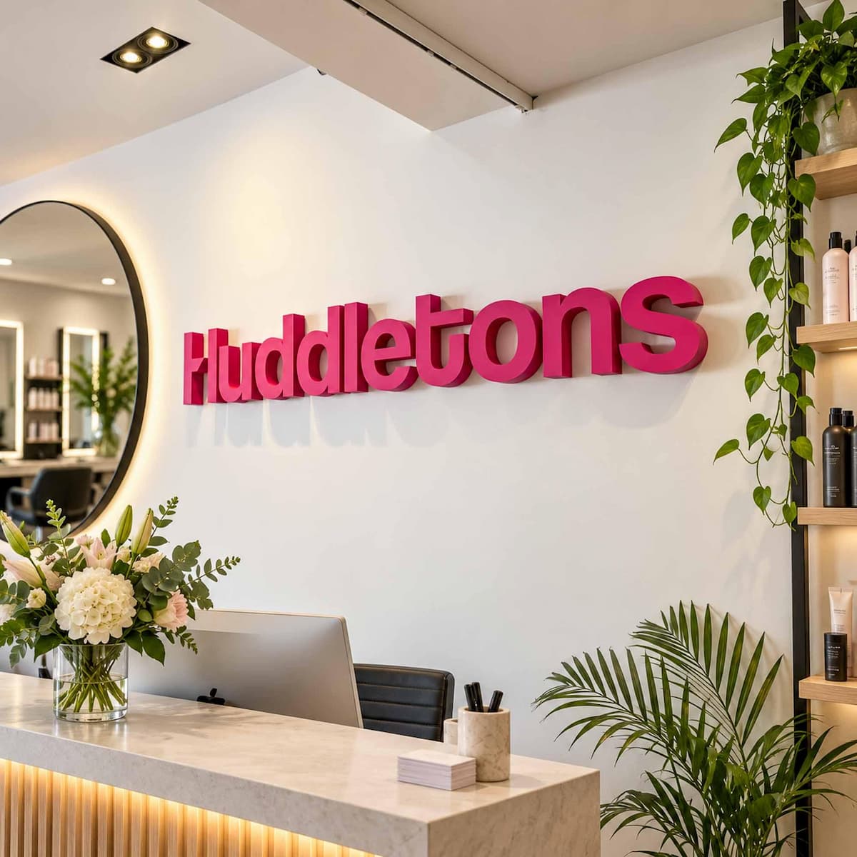
This guide explains the main points to consider when specifying office signage for receptions, meeting rooms, open-plan offices and shared commercial buildings.
Begin With the Purpose of the Signage
Before selecting materials or finishes, establish what each sign needs to achieve.
Directional signs guide visitors towards reception areas, meeting rooms, toilets, lifts and staircases. A larger workplace may require a complete wayfinding scheme rather than a collection of unrelated signs.
Identification signs show the name or purpose of a room, department or area. These include office door signs, meeting room signs, office door plaques and signs for staff-only areas.
Instructional and regulatory signs communicate rules, restrictions or safety information. Emergency and statutory signage should follow the appropriate regulations and should not be replaced by decorative branding.
Brand signs display the company logo, values, mission statements or other visual elements. These are most commonly installed in reception areas, meeting rooms and prominent shared spaces.
Defining the purpose of each sign prevents the scheme from becoming cluttered and helps the project team decide where fully customised signage is appropriate and where a standard, easily updated system would work better.
Map How People Move Through the Office
Effective office signage should follow the routes people naturally take through the building.
Begin at the main entrance and consider the questions a first-time visitor might have. Is the reception desk immediately visible? Can the visitor identify the correct floor, department or meeting room? Are lift lobbies, corridors and junctions clearly marked?
A wayfinding sign should provide information before someone needs to choose a direction. Installing it after the relevant junction makes it much less useful.
The amount of information must also be controlled. Too many messages in one location can be as confusing as having no signage. Clear wording, consistent arrows and a predictable visual hierarchy make workplace navigation easier.
In frequently changing offices, modular signs can be useful because room names and destinations can be updated without replacing the entire system. Permanent brand features can then be reserved for reception walls and other prominent locations.
Coordinate Signs With the Office Environment
The position and scale of a sign should be considered in relation to the whole space, not only the available section of wall.
A sign behind a reception desk must remain visible after monitors, furniture, lighting and decorative features have been installed. Signs used in corridors or open-plan offices need to be readable from a greater distance than an office door plaque viewed from close range.
Glass partitions create additional considerations. Graphics and signs need enough contrast to remain visible against changing backgrounds. Privacy manifestations and safety markings may also be required independently of decorative wall graphics or brand elements.
Before production, record:
- The available wall width and height
- The normal viewing distance
- Furniture or equipment positioned in front of the wall
- Door swings and circulation routes
- Lighting direction and possible glare
- The construction and condition of the wall
- Any cables, pipes or services behind the surface
- Whether the sign may need to be removed or updated
These checks help determine the appropriate overall size and reduce the risk of installation problems.
Use Wall Lettering as Part of the Brand Experience
A reception wall is often the first substantial brand feature seen by clients, employees and other visitors. Raised lettering can give the company name or logo a physical presence without requiring a large printed panel.
The depth, colour and finish affect how the lettering interacts with the room. Deeper letters create stronger side profiles and shadows. Slim acrylic lettering provides a lower-profile finish and can be more suitable for fine text or detailed artwork.
For businesses planning a reception feature, custom 3D wall letters can be produced to follow supplied brand artwork, colours and available wall space. The most appropriate construction will depend on the line thickness, required depth, face finish and intended location.
Acrylic-faced letters can provide matt, gloss, mirror or metallic effects. Lightweight raised lettering may suit interior walls where a substantial appearance is required without excessive weight. The objective should be to reproduce the brand clearly rather than adding depth or decoration that reduces legibility.
Select Materials for the Location
There is no single material suitable for every office signage application. The correct choice depends on the environment, expected lifespan, detail and fixing surface.
Acrylic signs are widely used for office signage because they provide clean edges and a range of finishes. Matt acrylic reduces reflections, while gloss and mirror finishes create a more polished appearance. Clear acrylic plaques can be printed and mounted using stand-off fixings where a layered presentation is required.
Lightweight 3D letters work well on interior office and reception walls. Acrylic-faced versions add a refined surface while retaining visible depth.
Wooden signs can introduce a warmer or more traditional aesthetic, particularly in hospitality spaces, creative workplaces or buildings where natural materials form part of the interior design.
Exterior signage must be assessed separately. Aluminium composite panels, exterior-grade acrylic and UV-stable print systems may be appropriate, depending on the construction. Lightweight materials designed for interiors should not automatically be specified outdoors.
The supplier should always be told whether the sign is for an interior or exterior location.
Follow the Company’s Brand Guidelines
Office signs should feel like part of the same identity rather than a separate decorative system.
Brand guidelines normally define the approved logo, colours, typography, clear space and acceptable variations. These should be supplied at the start of the process with the original vector artwork.
Clean and legible typography is particularly important in directional and identification signs. A typeface that works well in marketing material may be difficult to read on a small door sign or from the opposite end of a corridor.
High contrast between the wording and background improves clarity. Fine letter strokes, narrow gaps and small details may need to be adjusted for the selected production method. Any changes should be shown on the design proof before manufacturing.
Terminology should also remain consistent. If one part of the office uses “Meeting Room” and another uses “Conference Suite” for the same type of space, visitors may assume they are different facilities.
Consider Accessibility
A professional workspace should be understandable and usable by as many people as reasonably possible.
Important signs should be positioned where they are easy to see, normally close to the relevant doorway or decision point. Text size, contrast, viewing distance and mounting height should be assessed together.
Where tactile lettering, Braille or regulated accessibility signage is required, the project team should consult an appropriate specialist and check the applicable standards. Decorative office signs should support the wider accessibility scheme, not replace it.
Testing a proposed wayfinding layout with someone unfamiliar with the building can also reveal unclear directions that the regular project team may overlook.
Confirm the Fixing Method
Installation should be considered when the signs are specified, not after they arrive.
Lightweight lettering may be supplied with strong fixing pads and a positioning template. Heavier signs, larger constructions or layered products may require wall hangers, sign locators or mechanical fixings.
Stand-off fixings are frequently used for acrylic plaques, but they require accurate drilling and a suitable wall surface. Glass partitions, tiled walls and surfaces containing hidden services need particular care.
Newly decorated walls should be fully cured before adhesive products are installed. Dust, grease, loose paint and textured finishes can all reduce adhesion. The sign supplier’s fitting guidance should be checked against the wall manufacturer’s or decorator’s recommendations.
If contractors will install the signs, they should receive the approved dimensions, layout and fixing information before attending the site.
Supply Suitable Artwork and Approve a Proof
Vector artwork produces the cleanest result for bespoke office signs. Common formats include AI, EPS, SVG and vector PDF.
A low-resolution image copied from a website may look acceptable on screen but can produce rough edges when enlarged or converted into cut lettering. If suitable artwork is unavailable, it may need to be professionally redrawn.
The supplier will normally require:
- Approved vector artwork
- Required overall dimensions
- Brand colour references
- Preferred material and finish
- Interior or exterior location
- A photograph of the installation area
- Relevant wall measurements
- The required completion date
Customers should receive a digital proof showing the proposed layout, size and agreed finish before production. This is the point to check spelling, proportions, colours and the relationship between separate elements.
Approval should only be given when all relevant stakeholders are satisfied. Changes requested after production begins may require components to be remade.
Plan for Future Changes
Not every sign should be equally permanent.
Company logos and reception features may remain in place for years, while department names, staff locations and meeting room functions can change more frequently.
A practical office signage scheme separates permanent brand elements from information that may need regular updates. Modular door plaques, replaceable inserts or digital room-booking displays may be more appropriate for changing information.
Signs should also remain clean, legible and relevant. Recording the approved artwork, materials and supplier details makes future replacements or additions easier to match with the original scheme.
Final Specification Checks
Before approving the signage, confirm:
- The purpose and wording of every sign
- Visitor routes and decision points
- Viewing distances and available wall space
- Approved brand artwork and colours
- Suitable text size and contrast
- Interior or exterior material requirements
- Accessibility and regulatory requirements
- Fixing methods and wall condition
- Installation responsibility
- Proof approval and production timescale
Conclusion
Good office signage combines navigation, information and brand identity in one coordinated system. It helps visitors understand the building, supports employees in their daily environment and creates a consistent impression of the organisation.
The most effective schemes are planned alongside the wider commercial fit-out. By confirming the routes, artwork, materials, fixing surfaces and future maintenance requirements early, designers and contractors can avoid rushed decisions and produce signage that feels like an intentional part of the workplace.